html - 一道簡單CSS的面試題
問題描述
今天剛剛碰到的 hr要求一個(gè)半小時(shí)完成
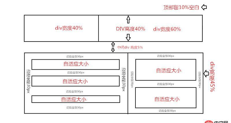
要求p自適應(yīng)大小
邊距都是30px,剩下的p全部自適應(yīng)屏幕 如果有根據(jù)屏幕大小自動變化CSS樣式的更好
要求已經(jīng)寫在圖上了 有沒有萌新前來練手
問題解答
回答1:<style type='text/css'><!-- html,body {height: 100%; } body, body * {margin: 0;padding: 0; } p {box-sizing: border-box;-webkit-box-sizing: border-box;border: 1px solid #333; } .header_left, .header_right {height: 40%;float: left;margin-top: 10%; } .header_left {width: 40%; } .header_right {width: 60%;border-left-style: none; } .clear {clear: both;border: none; } .main {margin-top: 5%;height: 45%;color: red;text-align: center; } .main_left, .main_right {float: left;width: 60%;height: 100%;border: none; } .main_right {width: 40%;border-left: 1px solid #333; }.main_left_top,.main_left_middle,.main_left_bottom,.main_right_top,.main_right_bottom { margin: 30px;}--></style> <p class='header_left'></p><p class='header_right'></p><p class='clear'></p> <p class='main'><p class='main_left'><p class='main_left_top'>隨著內(nèi)容適應(yīng)大小</p><p class='main_left_top'>隨著內(nèi)容適應(yīng)大小</p><p class='main_left_bottom'>隨著內(nèi)容適應(yīng)大小</p> </p><p class='main_right'><p class='main_right_top'>隨著內(nèi)容適應(yīng)大小</p><p class='main_right_bottom'>隨著內(nèi)容適應(yīng)大小</p></p><p class='clear'></p> </p>回答2:
有2種方法實(shí)現(xiàn)一種是float,一種是flex,不過可能flex的兼容性不太好float布局
flex布局
回答3:這個(gè)問題不難啊,我會,分分鐘搞定
回答4:圖已經(jīng)寫得很詳細(xì)了,只要根據(jù)圖寫出相應(yīng)的布局就OK了。如果還是迷茫的,建議你從鞏固一下p布局。
回答5:挺簡單的,只是自適應(yīng)不是響應(yīng)式,都標(biāo)著百分比了
相關(guān)文章:
1. docker網(wǎng)絡(luò)端口映射,沒有方便點(diǎn)的操作方法么?2. debian - docker依賴的aufs-tools源碼哪里可以找到啊?3. docker images顯示的鏡像過多,狗眼被亮瞎了,怎么辦?4. 關(guān)docker hub上有些鏡像的tag被標(biāo)記““This image has vulnerabilities””5. docker容器呢SSH為什么連不通呢?6. 前端 - ng-view不能加載進(jìn)模板7. android clickablespan獲取選中內(nèi)容8. nignx - docker內(nèi)nginx 80端口被占用9. angular.js - angular內(nèi)容過長展開收起效果10. python - from ..xxxx import xxxx到底是什么意思呢?

 網(wǎng)公網(wǎng)安備