解決Python Matplotlib繪圖數(shù)據(jù)點(diǎn)位置錯(cuò)亂問題
在繪制正負(fù)樣本在各個(gè)特征維度上的CDF(累積分布)圖時(shí)出現(xiàn)了以下問題:
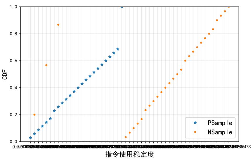
問題具體表現(xiàn)為:
1.幾個(gè)負(fù)樣本的數(shù)據(jù)點(diǎn)位置倒錯(cuò)
2.X軸刻度變成了亂七八糟一團(tuán)鬼東西
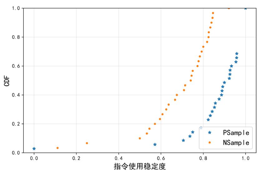
最終解決辦法
造成上述情況的原因其實(shí)是由于輸入matplotlib.plot()函數(shù)的數(shù)據(jù)x_data和y_data從CSV文件中直接導(dǎo)入后格式為string,因此才會(huì)導(dǎo)致所有數(shù)據(jù)點(diǎn)的x坐標(biāo)都被直接刻在了x軸上,且由于坐標(biāo)數(shù)據(jù)格式錯(cuò)誤,部分點(diǎn)也就表現(xiàn)為“亂點(diǎn)”。解決辦法就是導(dǎo)入x,y數(shù)據(jù)后先將其轉(zhuǎn)化為float型數(shù)據(jù),然后輸入plot()函數(shù),問題即解決。
補(bǔ)充知識:matplotlib如何在繪制時(shí)間序列時(shí)跳過無數(shù)據(jù)的區(qū)間
其實(shí)官方文檔里就提供了方法,這里簡單的翻譯并記錄一下.
11.1.9 Skip dates where there is no dataWhen plotting time series, e.g., financial time series, one often wants to leave out days on which there is no data, e.g., weekends.By passing in dates on the x-xaxis, you get large horizontal gaps on periods when there is not data.
The solution is to pass in some proxy x-data, e.g., evenly sampled indices, and then use a custom formatter to format these as dates.The example below shows how to use an ‘index formatter’ to achieve the desired plot:
解決方案是通過傳遞x軸數(shù)據(jù)的代理,比如下標(biāo),
然后通過自定義的’formatter’去取到相對應(yīng)的時(shí)間信息
manual內(nèi)示例代碼:
import numpy as npimport matplotlib.pyplot as pltimport matplotlib.mlab as mlabimport matplotlib.ticker as ticker#讀數(shù)據(jù)r = mlab.csv2rec(’../data/aapl.csv’)r.sort()r = r[-30:] # get the last 30 daysN = len(r)ind = np.arange(N) # the evenly spaced plot indicesdef format_date(x, pos=None): #保證下標(biāo)不越界,很重要,越界會(huì)導(dǎo)致最終plot坐標(biāo)軸label無顯示 thisind = np.clip(int(x+0.5), 0, N-1) return r.date[thisind].strftime(’%Y-%m-%d’)fig = plt.figure()ax = fig.add_subplot(1,1,1)ax.plot(ind, r.adj_close, ’o-’)ax.xaxis.set_major_formatter(ticker.FuncFormatter(format_date))fig.autofmt_xdate()plt.show()
示例:
同樣一段數(shù)據(jù)上為原始,下為去掉無數(shù)據(jù)間隔區(qū)間
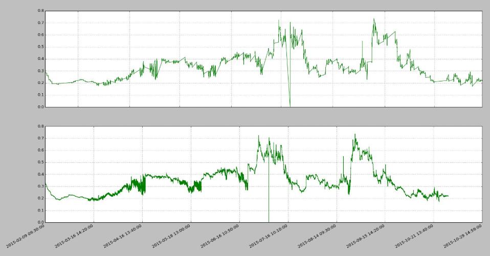
import pandas as PDimport numpy as NPimport matplotlib.pyplot as PLTimport matplotlib.ticker as MTKfile = r’vix_series.csv’df = PD.read_csv(file, parse_dates=[0, 2])#用下標(biāo)代理原始時(shí)間戳數(shù)據(jù)idx_pxy = NP.arange(df.shape[0])#下標(biāo)-時(shí)間轉(zhuǎn)換funcdef x_fmt_func(x, pos=None): idx = NP.clip(int(x+0.5), 0, df.shape[0]-1) return df[’datetime’].iat[idx]#繪圖流程def decorateAx(ax, xs, ys, x_func): ax.plot(xs, ys, color='green', linewidth=1, linestyle='-') ax.plot(ax.get_xlim(), [0,0], color='blue', linewidth=0.5, linestyle='--') if x_func: #set數(shù)據(jù)代理func ax.xaxis.set_major_formatter(MTK.FuncFormatter(x_func)) ax.grid(True) returnfig = PLT.figure()ax1 = fig.add_subplot(2,1,1)ax2 = fig.add_subplot(2,1,2)decorateAx(ax1, df[’datetime’], df[’vix_all’], None)decorateAx(ax2, idx_pxy, df[’vix_all’], x_fmt_func)#優(yōu)化label顯示,非必須fig.autofmt_xdate()PLT.show()
很多時(shí)候亂翻google還不如好好通讀官方manual…
以上這篇解決Python Matplotlib繪圖數(shù)據(jù)點(diǎn)位置錯(cuò)亂問題就是小編分享給大家的全部內(nèi)容了,希望能給大家一個(gè)參考,也希望大家多多支持好吧啦網(wǎng)。
相關(guān)文章:
1. 輕松學(xué)習(xí)XML教程2. jsp實(shí)現(xiàn)登錄驗(yàn)證的過濾器3. css代碼優(yōu)化的12個(gè)技巧4. jsp+servlet簡單實(shí)現(xiàn)上傳文件功能(保存目錄改進(jìn))5. 利用FastReport傳遞圖片參數(shù)在報(bào)表上展示簽名信息的實(shí)現(xiàn)方法6. xpath簡介_動(dòng)力節(jié)點(diǎn)Java學(xué)院整理7. msxml3.dll 錯(cuò)誤 800c0019 系統(tǒng)錯(cuò)誤:-2146697191解決方法8. jsp EL表達(dá)式詳解9. 解析原生JS getComputedStyle10. jsp cookie+session實(shí)現(xiàn)簡易自動(dòng)登錄

 網(wǎng)公網(wǎng)安備